TRADE
MISSION
TRADE
MISSION
TRADE
MISSION
Make trading easy and addictive
Make trading easy and addictive
2025
PROJECT OVERVIEW
I led the end-to-end redesign of Bitcoin.com’s trading feature; an outdated, yet vital part of the app. With a short brief from the CEO and no formal PRD, I conducted research, designed new flows, ran usability tests, and iterated quickly through async feedback, ensuring transparency and momentum throughout the project.
I led the end-to-end redesign of Bitcoin.com’s trading feature; an outdated, yet vital part of the app. With a short brief from the CEO and no formal PRD, I conducted research, designed new flows, ran usability tests, and iterated quickly through async feedback, ensuring transparency and momentum throughout the project.
"24H REVENUE FROM SWAPS SPEAKS FOR ITSELF. IF WE NAIL THIS, WE ADD A MAJOR GROWTH ENGINE TO THE COMPANY."
"24H REVENUE FROM SWAPS SPEAKS FOR ITSELF. IF WE NAIL THIS, WE ADD A MAJOR GROWTH ENGINE TO THE COMPANY."
"24H REVENUE FROM SWAPS SPEAKS FOR ITSELF. IF WE NAIL THIS, WE ADD A MAJOR GROWTH ENGINE TO THE COMPANY."
WHY
ceo has spoken
ceo has spoken
As the swap fee of top crypto wallet jumped significantly, enhancing our own Swap became a priority overnight.
As the swap fee of top crypto wallet jumped significantly, enhancing our own Swap became a priority overnight.
As the swap fee of top crypto wallet jumped significantly, enhancing our own Swap became a priority overnight.
*data from DefiLama


As an active user of the product myself, I had firsthand awareness of the challenges. Due to time constraints, I prioritized solving known pain points over formal validations
As an active user of the product myself, I had firsthand awareness of the challenges. Due to time constraints, I prioritized solving known pain points over formal validations
As an active user of the product myself, I had firsthand awareness of the challenges. Due to time constraints, I prioritized solving known pain points over formal validations
CHALLENGE #1
The app felt outdated and static compared to modern wallets.
The core features were buried in a cluttered layout, making them hard to
discover or navigate.
The app felt outdated and static compared to modern wallets.
The core features were buried in a cluttered layout, making them hard to discover or navigate.
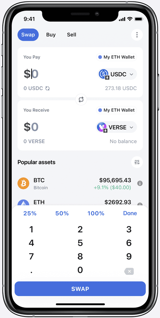
SOLUTION

Clean and spacious interface, modelled after proven interfaces
Elevated feature visibility by adding 'Trade' to the main navigation
CHALLENGE #2
New users struggled to discover trending tokens or understand what to explore next.
Even experienced users found it hard to access basic token info without leaving the swap flow.
New users struggled to discover trending tokens or understand what to explore next. Even experienced users found it hard to access basic token info without leaving the swap flow.
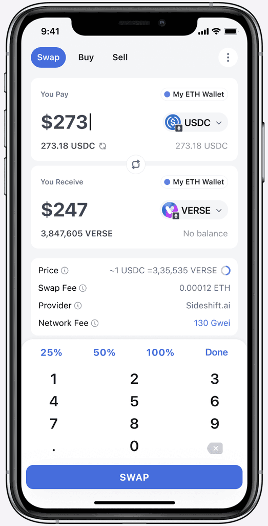
SOLUTION
These changes aimed to build confidence, support discovery,
and reduce back-and-forth across the app.

Highlighted trending tokens to reduce decision paralysis and spark action

Enabled faster decision-making by letting users sort tokens by what matters to them

Integrated token details directly into flow to enable deeper context without drop-off
CHALLENGE #3
Users transitioning to chains like Polygon couldn’t send or swap assets.
Unlike Bitcoin, these networks require native tokens to pay as gas;
something most new users didn’t yet have.
Users transitioning to chains like Polygon couldn’t send or swap assets. Unlike Bitcoin, these networks require native tokens to pay as gas; something most new users didn’t yet have.
SOLUTION
Reduced entry friction by seeding gas for first-time users, nudging them toward low-fee networks like Polygon
While the feature launched recently (March),
early signs of impact are clear
While the feature launched recently (March),
early signs of impact are clear
ADOPTION
~600%
Achieved a 7× increase in daily Trading usage within one month post-launch
REVENUE
12.8%
Helped drive a 12.8% increase in
Trading-related revenue post-launch


Ideas that were explored
FIGURE OUT TIMELINES AND EFFORTS
FIGURE OUT TIMELINES AND EFFORTS
I created a low effort solution to gauge timelines,
efforts, and the team sentiments.
I created a low effort solution to gauge timelines, efforts, and the team sentiments.
LOW EFFORT;EXISTING COMPONENTS AND LAYOUTS
LOW EFFORT;EXISTING
COMPONENTS AND LAYOUTS


B. SINGLE PAGE FLOW
This was inspired by doing extensive competitive research.
Single page layout which is easy to understand and efficient.
This one was an obvious winner; simple and efficient
B. SINGLE PAGE FLOW
This was inspired by doing extensive competitive research.
Single page layout which is easy to understand and efficient.

NAVIGATIONG THROUGH A
TECHNICAL CONSTRAINT
NAVIGATIONG THROUGH A
TECHNICAL CONSTRAINT
NAVIGATING
THROUGH A
TECHNICAL
CONSTRAINT
When users interacted with assets available on multiple networks, they were forced to choose a preferred network every time, adding friction to an already complex flow. I explored three design directions to reduce this decision fatigue.
When users interacted with assets available on multiple networks,
they were forced to choose a preferred network every time,
adding friction to an already complex flow.
I explored three design directions to reduce this decision fatigue.
CURRENT BEHAVIOUR;USER PICKS NETWORK EACH TIME
CURRENT BEHAVIOUR,
ASK EVERY TIME

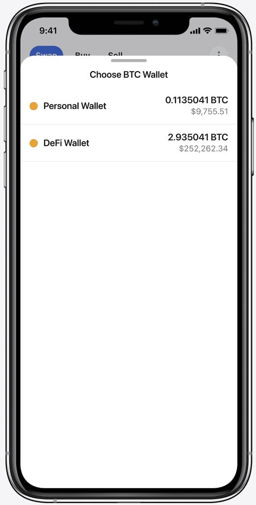
B. DEFAULT NETWORK, SWITCH IF NEEDED
B. DEFAULT NETWORK,
SWITCH IF NEEDED
Introduced a default network selector that acted both as a
confirmation and an entry point to switch. This gave users
control while avoiding repeated interruptions.
We eventually went with approach 2 due to
fewer dev changes and easier rollout
We eventually went with approach 2 due to fewer dev changes and easier rollout

C. SHOW ALL OPTIONS UPFRONT
C. SHOW ALL OPTIONS UPFRONT
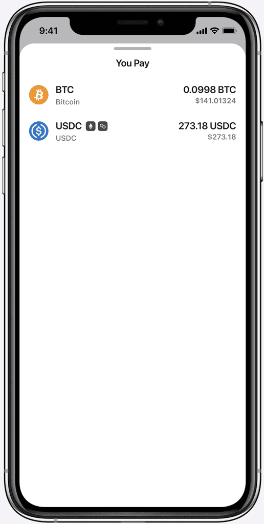
In the current app, assets available on multiple networks are grouped under one entry. When users select it, they’re asked to choose a network afterward. I proposed showing each version (per network) separately upfront, so users don’t have to make that decision mid-flow. It simplifies the experience and removes an extra step.

REFINING THE EXPERIENCE
REFINING THE EXPERIENCE
REFINING THE EXPERIENCE
After aligning on the core direction from earlier rounds, I continued feedback loops to refine microcopy, placement, and transitions for a smoother first-time experience.
When users interacted with assets available on multiple networks,
they were forced to choose a preferred network every time,
adding friction to an already complex flow.
I explored three design directions to reduce this decision fatigue.
PROTOTYPE USED FOR USABILITY TESTING
PROTOTYPE USED FOR
USABILITY TESTING


WITH THE MAIN FLOW LOCKED, I FOCUSED ON POLISHING AND TESTING
WITH THE MAIN FLOW LOCKED, I FOCUSED ON POLISHING AND TESTING
Due to time constraints, I gathered feedback from internal team-members
as well as a few personal connections who were crypto aware. And here's what I found that brought up more changes:
A few of them were confused whether to click Asset logo or the ticker (e.g., BTC)
Most of the networks and their native tokens have similar names, so network name next to You pay and You get next felt confusing
Most of them were interested in having the ability to enter their local currency
When users interacted with assets available on multiple networks,
they were forced to choose a preferred network every time,
adding friction to an already complex flow.
I explored three design directions to reduce this decision fatigue.
Due to time constraints, I gathered feedback from internal team-members
as well as a few personal connections who were crypto aware. And here's what I found that brought up more changes:
A few of them were confused whether to click Asset logo or the ticker (e.g., BTC)
Most of the networks and their native tokens have similar names, so network name next to You pay and You get next felt confusing
Most of them were interested in having the ability to enter their local currency
THE INSIGHTS ABOVE LET TO FINAL UI TWEAKS THAT SHAPED THE MVP VERSION SHOWN EARLIER IN THE CASE STUDY.
THE INSIGHTS ABOVE LET TO FINAL UI TWEAKS THAT SHAPED THE MVP VERSION SHOWN EARLIER IN THE CASE STUDY.